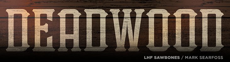
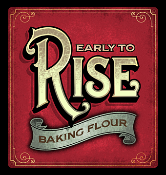
LHF Sawbones (with two versions included) is authentic western Americana from Mark Searfoss.
Easy to read and compact, it works well for signs, labels and book
covers.
This easy to read and expertly balanced letter style is true to the
period it was inspired from. You'll find LHF Imperial quite suitable for
replicating labels and signage from the late 1800's to early 1900's era.
All letters have been drawn from scratch and are original, direct from
Mark Searfoss' own hands to your computer. Includes 39 bonus alternates and
ligatures.
Classic vintage styling meets type perfection in LHF Bakersfield. Mark
Searfoss has carefully mitered the serifs of each letter to ensure they aren't
too sharp, which makes it easier to outline too. All letters are
well-balanced and includes 16 bonus alternates and ligatures.
Though similar fonts abound, look closer and you'll find LHF Supply Co. from Mark Searfoss to be vastly
better drawn and balanced. You receive 8 fonts in this set: Regular,
Outline, Slant, Slant Outline, Slim, Slim Outline, Slim Slant, Slim
Slant Outline. Perfect for sports teams and other athletic designs.
Vintage styling meets modern OpenType technology with this 10 layered
font set from Mark Searfoss.Who knew designing could be this fun?
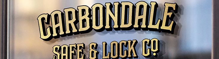
Carbondale allows you to create professional-looking effects quickly and
painlessly.
You receive all 10 fonts shown.
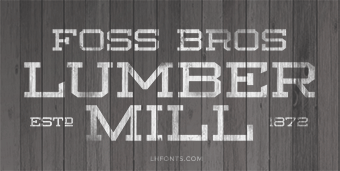
Lumbermill from Mark Searfoss is a perfect compliment to vertical fonts or scripts and is an
authentic period-style workhorse typeface. Commonly seen on signage
around the late 1800's. You receive 3 fonts: Regular, Outline and
Shadow. These fonts are not intended to be layered together. Glyph
samples below are depicted exactly as they will appear when typed.
Includes 28 bonus alternate glyphs.
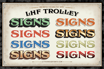
Thanks to Asher Emerson for pointing out that the lowercase "n" in LHF Trolley Shadow 2 was incorrect. It was displaying the Shadow 1 style instead of the Shadow 2 style.
This was corrected and all fonts were updated to version 1.2 (although only LHF Trolley Shadow 2 was actually changed.)
Login to your account to redownload and get the latest version: https://letterheadfonts.com/login
LHF Whistler was updated to version 1.3 today. We removed "OE", "oe", "AE", and "ae" glyphs from automatic ligatures. They shouldn't have been added to the OpenType liga feature. Thanks to Trish Fullerton for pointing it out. This is a free download for customers who have purchased previous versions of LHF Whistler. Update to the latest version from your Account Manager and replace all existing fonts. After installing, verify version by typing the bar key: |
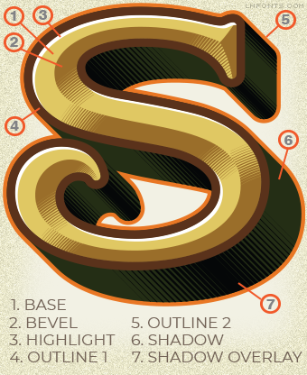
After several months of hard work, the LHF Counselor font set is finally here! You receive 7 fonts intended to be used together to create unique bevel and shadow effects. See the examples here:
We've made improvements to LHF Prentice. In the new 1.2 version we've elongated the descender on the comma and semicolon characters. This helps distinguish the comma from the period.
Please uninstall all 4 of your existing LHF Prentice fonts. Then, simply log in to your account and download the entire .zip package for the order again. You will receive the new 1.2 versions of LHF Prentice released May 21, 2019. You can easily check which version you're using by typing the bar character ( | ). The version number and date will be shown.
We're pleased to announce the release of LHF Champ by Mark Searfoss. This extensive, multi-part font
set features 8 stacking fonts, including prismatic versions and 2
non-stacking versions for a total of 10 inspiring fonts. Download for only $45 through May 8th.
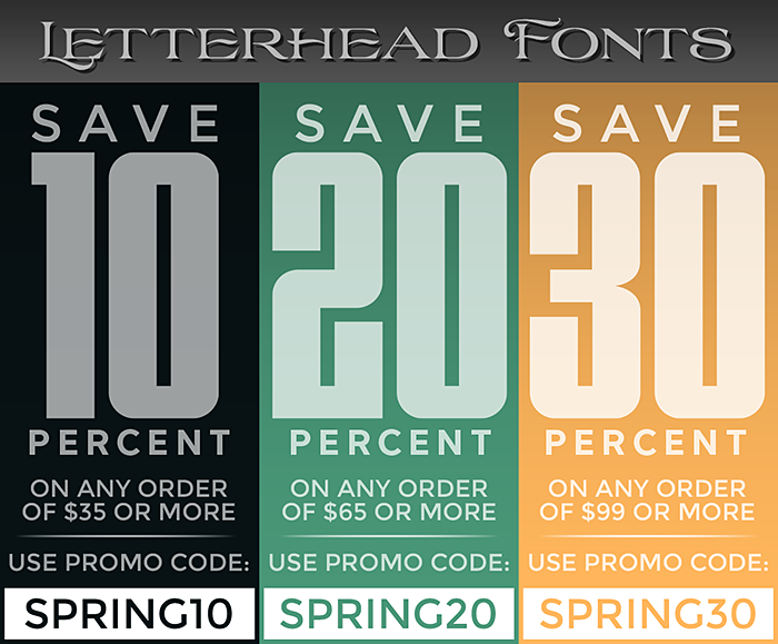
Spring is finally here and you could save up to 30%. Save 10% when your
order totals $35 or more, using promo code: SPRING10. Save 20% when your
order totals $65 or more, using promo code: SPRING20. Save 30% when your
order totals $99 or more, using promo code: SPRING30. Sale ends April
17th, so go ahead and use all three codes (one at a time, of course). Excludes already discounted packages.
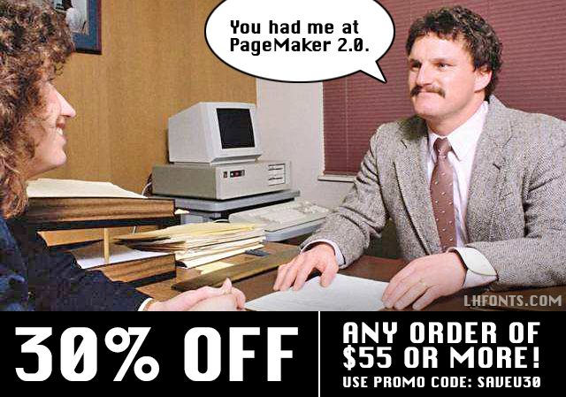
Just a reminder that Chicago was a truly ugly font... and that you can save 30% on your purchase of $55 or more when you use promo code: SAVEU30. Promotion ends March 8th, so download several to take full advantage while you can. Excludes special packages and multiple licenses.
We've made improvements to LHF Speakeasy. In the new 1.3 version we've fixed an issue which caused the "Her" ligature to display improperly.
Please
uninstall all 3 of your existing LHF Speakeasy
fonts.
Then, simply
log in to your
account and download the entire .zip package for the order
again. You will receive the new 1.3 versions of LHF Speakeasy
released
today (Feb. 14th). You can easily check which version you're using by
typing the bar character ( | ). The version number and date will be
shown.
We've made improvements to LHF Dark Horse. In the new 1.1 version we've included an all new, non-distressed, solid version (titled LHF Dark Horse 3).
Please
uninstall both of your existing LHF Dark Horse
fonts.
Then, simply
log in to your
account and download the entire .zip package for the order
again. You will receive the new 1.1 versions of LHF Dark Horse
released
today (Feb. 13th). You can easily check which version you're using by
typing the bar character ( | ). The version number and date will be
shown.
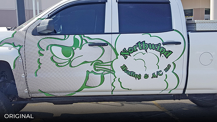
Original: This design isn't doing the owner any favors. The graphic
takes up the bulk of the space and yet it's not immediately clear what
it is. (An angry looking cloud isn't going to make a positive impression
on people.) The lettering is hard to read due to the font
and the decision to put it on an arc. Outlining this shade of green
with black doesn't help. Green seems like an unnatural color for
something having to do with clouds and either heating or cooling.
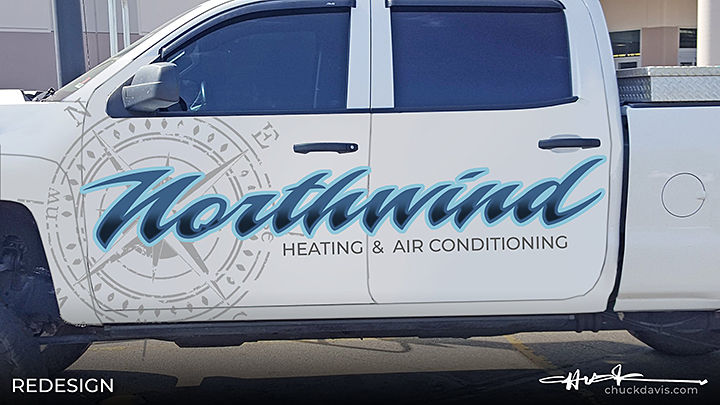
Redesign: We catch the eye using a script (LHF Piranha Script) which
carries the eye across and gives it a sense of a motion. Changing the
color to blue seems like a better choice for heating and cooling, plus
it's clean. Add a simple dark fade at the bottom to add contrast and
help with readability. A light gray compass in the background provides
interest and also acts as a bullseye to draw the eye into the beginning
of the word. We drop the "LLC" because it's unnecessary and contrary to
popular opinion does not really have to be used on all advertising. A
simple clean design that took only minutes to create.
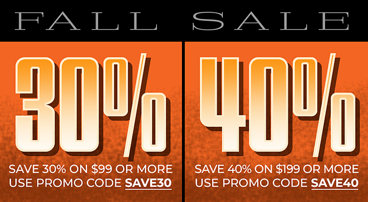
Save 30% when your order totals $99 or more (use promo code: SAVE30). Save 40% when your order totals $199 or more (use promo code: SAVE40). The more you order, the more you save, so take advantage while you can. Promo excludes LHF Iron Lace (which is on sale for 50% off). Ends November 1st.
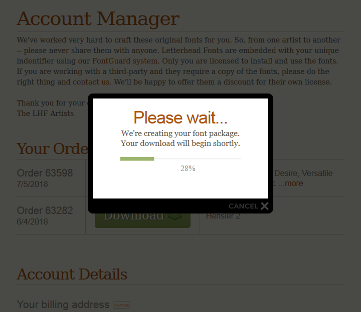
We've made improvements to our cart system to speed up large font package downloads, such as those containing the complex LHF Versatile fonts. In addition to speeding up the download process, we've also included a progress bar in the download window, which displays the font compiling & zipping process.
We're pleased to announce the release of LHF Scarlet Script by Denise Bayers. Experienced designers will appreciate the versatility Scarlet Script
provides, while beginners will find it very easy to acheive professional
results using the various overlays.
Denise very carefully hand-crafted each letter to flow naturally into the next
in order to retain the hand-lettered appearance. Each font includes a
generous 64 alternates, including special ending swash letters. Download this 5 font set for only $49 (through 7/30).
All material property of Letterhead Fonts • Copyright 2024 Letterhead Fonts • All rights reserved Redistribution or republication of any software, images, text or video strictly prohibited