After careful deliberation (and much delay), the judges final picks for the Letterhead Fonts 2009 Design Competition are as follows...
 1st Place: Jason Nale
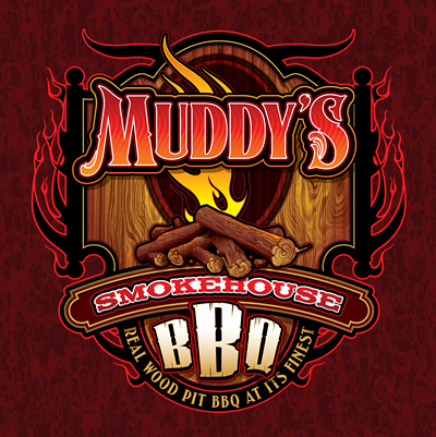
Muddy's has all the elements of a good design. While there is a lot going on in the design, the layout draws the eye downward to flow smoothly through it. The copy has been prioritized so that it is clear what is being sold. For his efforts, Jason wins $200 and his choice of any LHF font.
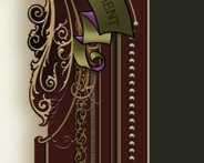
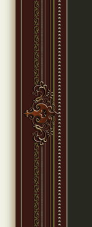
Fonts used: Signmaker, Fancy Full Round, Orchard, Palmer2nd Place: Tim BishopAs with Jason's design, Tim's Bent Axles prioritizes the copy without sacrificing style. It's a perfect balance between style and readability. His work serves as a reminder of the talent we lost last year when Tim suffered a fatal heart attack. His $75 prize will be sent to his wife.
Fonts used: Orchard, Ragged Brad3rd Place: Shannon Brown
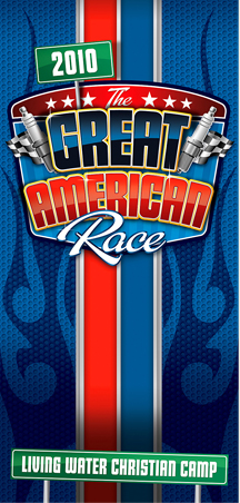
Shannon had two good designs that made it into the final rounds of judging (his "Looking Up" design receives Honorable Mention below). The Tallington font was a good choice for this vertical racing-themed brochure. Besides his dramatic use of color and highlights, the layout is logical and appropriate. Shannon receives a free LHF font.
Fonts used: Tallington, Red Sable ScriptHonorable Mention: Brian Collins
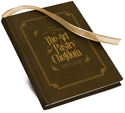
Brian displays creative and expert use of type with our Quaker font. The design is simple yet very appropriate to the nature of the book.
Fonts used: QuakerHonorable Mention: Shannon Brown
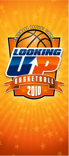
Shannon's design is both eye-catching and very well laid out. Expert use of shadows and highlights make the design come alive with energy -- exactly what you need for a basketball themed design.
Fonts used: Tallington, Convecta
Thank you!Thanks to everyone who entered the 2009 Design Competition. Your good designs help us show others what is possible using our fonts. Please don't hold it against us if your design didn't win this year. The fact that your design even made it into the
2009 Design Competition album is a testimony to your good design skills. Because only the best of the best was chosen to compete. And of course that makes our jobs as judges that much harder. With all the good designs to choose from, Dave Smith, Charles Borges and I had a very difficult time deciding. We hope you'll join us again next year.
--Chuck