Let's look at a bad business card design together and see how it can be improved.
1) I really dislike when people use a white halo effect to help text be
more readable. If you are doing this, ask yourself why. A better
solution is simply to improve the contrast of the text and background.
(Light text on dark background, dark text on light background.) The
designer here added some bevel effects to thin lettering too, which only
serves to muddy the text further and make it harder to read.
2) Same issue here. The designer added a white outline around the black
numbers. Why? Because black doesn't show up on dark green too well! A
better (and simpler) solution would have been to use a light color for
the numbers. All those white outlines are very distracting to the eye.
3) Same issue as numbers here, but even worse, the designer squeezed
the letters to make them fit instead of choosing a more vertical font
designed for this purpose. This causes the letters to have thick, bold
areas that attract the eye when we want the eye to flow through the text
easily. Nicholas who? I think the owner should display his last name...
but they probably decided to nix that due to space.
4) This guy
apparently makes cute concrete "cubs". All of this text is divided into
two square panels, but that separates it. All of these services are one
idea. They shouldn't be separated like this.
Compare with my
proposed redesign below. We got everything in without sacrificing
negative space. The design is eye-catching and airy, projecting a clean,
professional look to the potential customer. I put the emphasis on
"Landscaping" (using my Black Rose Script font) so that we get that idea
across first. I think his company name is secondary. A customer might
fight you on that point. I think it depends on the type of business and
how long its been around. One note about the phone number... I tried to
avoid making his area code as large as the rest of the phone number, but
it left a large gap on the left side. Therefore, I decided to make that
the same size. If a business is local, it usually isn't necessary to
have the area code the same size as the phone number. Making it smaller
or secondary in some way helps to reduce the amount of copy people have
to read through.
--Chuck
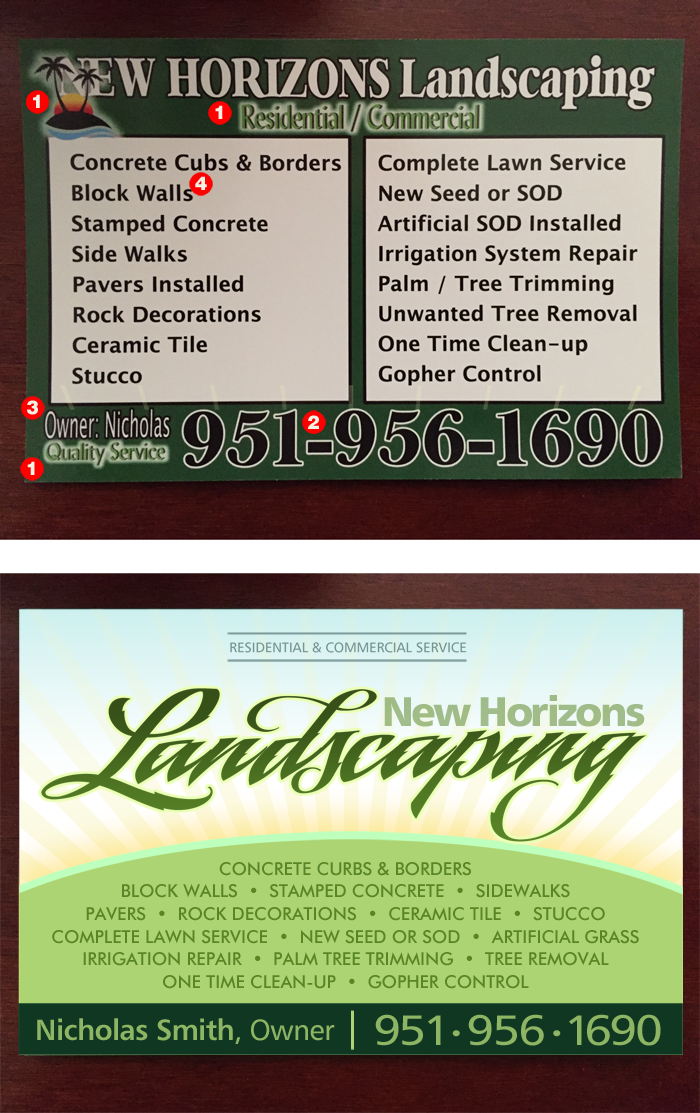
Fonts
used for the redesign: Humanist 777 (various weights), Futura (for
services offered) and LHF Black Rose Script (for "Landscaping").