

-
36 Sales
62 Ands
62 Thes
62 More Ands
62 More Thes
Advertisers Square
Alarm Block
Albury
Aledo
Aloha Script
Alpine Script
Amarillo 2
Ambrosia
American Sans
Americana Ornaments
Americana Panels
Americana Ribbons
Americano Script
Amethyst
Angel
Anna Banana 2
Antique Half Block 2
Antique Shop
Aristocrat
Ascribe
Asylum
Ataboy 165
Athletic Club
Avalanche
Bakersfield
Ballpark Script
Bandit
Bandolier
Bank Note
Basher
Beatnik Cowboy
Becker Classic
Becker No 45
Bella Vista
Bell Boy
Bergling Panels
Betterbilt
Big Bob
Big Dog
Big Top
Billhead
Birgitta
Black Rose Script
Blacksmith
Blackstone
Bluegrass
Blue Ridge
Boot Camp
Bootcut
Booth
Borges Catchwords 1
Borges Catchwords 2
Boston Ballpark
Bostonian
Boston Truckstyle
Bounce Script
Branding Iron
Brianna
Broadway Elements
Broadway Panels 1
Broadway Panels 2
Broadway Panels 3
Broadway Panels 4
Brooklyn
Brough Superior
Brushwork
Bulldog
Burbank
Burly
Cafe Corina
Californian
Calileo
Cameo
Carbondale
Carnivàle
Cartoon Cowboy
Casablanca
Castlerock
Cavalero
Cedar Creek
Centennial Banker
Centennial Panels 1
Centennial Panels 2
Centennial Panels 3
Centennial Panels 4
Champ
Chapman
Chateau
Chesham Sans
Chicago Script
Chromeliner
Chunky Block
Cigar Band
Cincinnati Poster
City Boy
Claretian
Classic Caps 2
Classic Panels 1
Classic Panels 2
Classic Roman 2
Coffee Shop
Colonial Roman
Columbiana
Comic Caps 2
Commie Caps
Conclave
Confection
Confection Essentials
Conservatory
Convecta
Cool Blue 2
Cordial
Cornbread Casual
Corner Specimens 1
Corner Specimens 2
Corner Specimens 3
Corrie
Cosmic Cursive
Counselor
Country Road
Dark Horse
David Design
Desire
Desire Rough & Ragged
Dickinson
Diploma
Distressed Block
Divine
Dixon Script
Doc Terwilligers
Dreadnought
Dublin
Duetta
Durango
Egyptian
Elixir 2
Emporium
Enchanted
Encore
English Rose
Engravers Ornaments
Ephemera
Equinox
Esoteric 3
Essendine 2
Euphoria 2
Factory
Fairground
Fancy Full Round
Farango
Fast Slant
Fat Cat
Fat Daddy
Fine Cut
Fine Line Roman
Firehouse
Five & Dime
Flamingo Script
Flash Script
Flathead
Folklore
Full Block
Future Tense
Garner
General Store
Gilmore
Ginger Ale
Gloria
Golden Era Art Elements
Goldsmith Script
Grants Antique
Grindle
Gunslinger
Gypsy
Hambone
Hamilton Nailhead
Hamilton Ornate
Handyman
Happy Fun Ball
Hastings Gold
Havana
Hazel
Heller's Script
Henderson
Hensler 2
Heritage
Hertford
Hexagon Modern
Hick Sticks
Hindlewood
Hudson
Imperial
Indian Script 2
Inkling
Ironhorse
Iron Knight
Iron Lace
Jalopy Joe
Jeff Marshall Script
Jewelo
Jumbo
King Edward
Kips Bay
Kiwi Casual
Kodiak
Kona Bold
Kung Faux
Lakeside
Larcher Roman
Light Face Roman
Lincoln
Locksmith
Logomotive
Lonerider
Lumbermill
Mackinlay
Magnum44
Main Street Ornaments
Main Street Panels
Majestic
Marie Script
Mastercraft
Matthews Modern
Matthews Thin
Melissa
Menace
Mercantile
Metro 39
Mikes Block
Milkman
Mister Kooky 2
Mister Muster
Mocha Script
Monogram Circle
Monogram Diamond
Monogram Oval
Mystery Font
Naylorville
New English
New Modern Classic
No Fishin
Novela
Nouveau Block
Nugget
Old Abe
Old Block
Old Flame
Old Iron
Old Stock
Old Tom
Olde Hickory
Opening Night
Orange Grove
Orchard
Ortlieb
Packard Script
Palace Bold
Pandora
Phantom
Pickle Barrel
Pierre
Pipeline
Piranha Script
Prentice
Preston
Prince
Pullman Train
Quadrex
Quaker
Quantum
Razer
Ragged Brad
Ransom
Raven
Rawson & Evans
Red Sable Script
Resolute
Retro Cafe
Retro Ricky
Ridgecrest
Ringer
Riverboat
Robusto
Roebuck
Ron Aplin ScriptNEW!
Roper
Ross 1929 Roman
Ross Antique Roman
Royal Crimson
Royal Script
Saddleback
Sadey Ann
Safire
Sanborn Thin
Sarah Script
Saratoga Ornaments
Saratoga Panels 1
Saratoga Panels 2
Saratoga Panels 3
Saratoga Panels 4
Sawbones
Scarlet Script
Scriptana
Sedona
Seranoa
Shelsey
Sheridan Script
Shocard Rodeo
Shogun
Shopfront
Signature
Signkit Script
Signmaker 2
Signwriter Roman
Silent Movie
Sinclair
Smalts
Sofia Script
Spaz
Speakeasy
Speedstyle
Spencer
Spindly
Spirit Script
Splash
Springfield
Spurred Egyptian
Square Block
Squeezebox
Stanford Script
State Fair
State Street
Stetson
Stevens Percepta
Stonecutter
Stonegate
Story Book
Stove Pipe Thin
Stratford
Stunt Roman
Sugargirl
Supply Co.
Swindler
Tallington
Tarantula
The Bat
Thick & Thin
Tideway Script
Timberlodge 2
Tonic
Towne Hall
Tributary
Triumph
Trolley
Tubby
Tuco's Revenge
Understudy
Union Thug
United Trade
Unlovable
Valencia
Vaudeville
Verdi
Versatile
Victoria
Vienna
Wade Dynamic
Wade Grotesque
Waterloo
Welo Thin
Western Rose
Whistler
Winchester 73
Woodmere
Workhorse
Yuma
Zenith 
-

-

-


-


 |
ACCOUNT LOGIN |  |
YOUR CART |  |
|
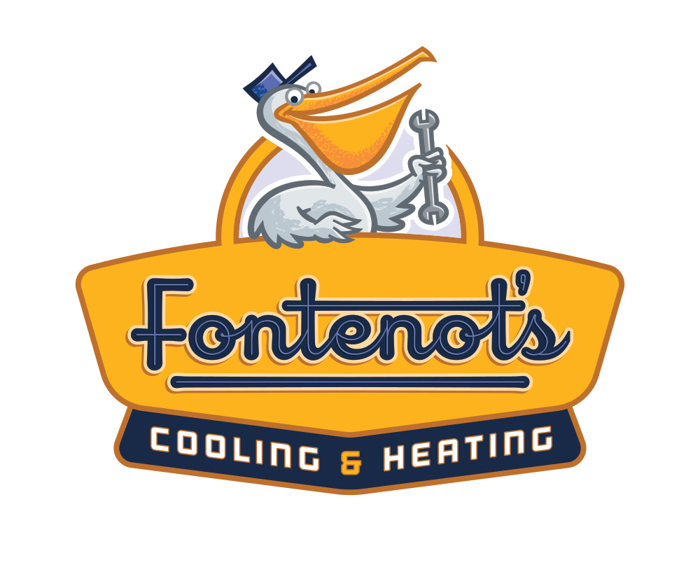
2015 Design Competition Winner: 1st Place Artists: Jeff Devey & Dan Antonelli, Graphic D-Signs, Inc. Client: Fontenots The judges chose the "Fontenot's" logo design as the first place winner for its layout and unusual color choices. The design features excellent use of negative space to draw the eye into the center, while the panel shapes draw the eye downward through the design. The font used (with modifications) fits the period retro-style the client desired. The illustration is unique and becomes an instantly recognizable mascot for the company. The simplicity of the design proves the "less is more" rule still applies, especially for logos. Jeff and Dan win a $100 cash prize and their choice of any LHF font. Letterhead Fonts used: LHF Heller's Script™ Chuck: You've become known for creating retro-style logos and illustrations, why do you think that is? Dan: We started doing a few back in 2005 or so, mainly for service companies, such as HVAC, or plumbing companies. We then won a few awards for some of the truck wraps we had designed, and then it just took off from there. At first, we were really trying to look at branding service businesses a bit differently. And due to the sign painting heritage that Jeff and I share, I think we had a natural affinity for that genre. I think we both enjoyed the exercise of trying to imagine we were designers from 60 or so years ago - and we had this client come to us for a logo. It involves a lot of research and study for the period. We still enjoy it, but it certainly becomes very challenging to try to come up with unique takes on the concept. It’s not always the right answer, either - and some guys right off the bat are insistent on us designing in that genre. We do a lot of very clean, corporate brands, as well, but some folks see the retro stuff, and they just want it. Jeff: I’ve always been attracted to designs from the early to mid-twentieth century, when hand lettering and illustration was everywhere. There were a couple of projects we worked on around 2005 that lent themselves well to that sort of period style, and as we added more of those pieces to our portfolio, we saw the demand for that style increase with our clients. There has been a trend towards period design and a revival of hand lettering across the industry, so I think that has had a lot to do with it as well. Chuck: Do you usually start your logo sketches on paper first? Dan: Jeff and I are a bit different in this regard. I sometimes do a sketch first, but most of the time I’m on the computer designing mainly the type treatment, and then relying on Jeff for the illustrative portion. In this case, I started with a rough idea for the panel shape, and dropped in the type and then Jeff came back and did the illustration on top. Jeff: I find it a lot easier to get my ideas out quickly on paper rather than having to navigate through a computer interface. I can sketch a lot of ideas loosely and quickly see what works and what doesn’t. It’s important to get the bad ideas out quickly in order to arrive at the good ideas. I find my first ideas are rarely my best.  Chuck: How long did this logo take you to create? Dan: I would say the process was about 30 hours. Chuck: Most heating & cooling logos would use light blue and red. Was there a conscious choice made to stay away from these colors and go with navy blue and yellow instead? Dan: Yes. Although we have done many HVAC logos with typical colors like blue and red, the whole point of a good small business brand is to try and be disruptive in the space and somewhat unexpected. So we look to build brands that stand out, and don’t fit in, or blend. So a unique color scheme is one thing that consumers can latch onto when so many messages are competing for their attention. Special consideration is given to how the brand needs to live on vehicles, as well, which is typically the single most important application of a service business’ brand. Jeff: We try to stay away from colors we feel are cliche or overused in an industry, especially if a client’s competitors are already using those colors. It’s important for a brand to be distinctive in its market and to not get lost in the noise. Chuck: Why a pelican? Jeff: This particular client came to us wanting a mascot of some sort, and during the initial conversation the idea was suggested that we make the mascot relevant to the client’s geographic location. The client’s business is located in Louisiana, so we sketched a few ideas based on alligators an pelicans, and the client decided the pelican felt more appropriate for their identity. Chuck: How was the pelican drawn? How did you do the texture on the beak and hat and why? Jeff: My initial sketches of the pelican were created traditionally using pencil and paper, then scanned, refined, and composed into the layout digitally using Adobe Photoshop. Once the client approved the direction, the final artwork was created using Adobe Illustrator. The texture was created using custom brushes in Illustrator. We felt the texture added visual appeal, and mimicked the illustrative style used in a lot of mid-century advertising. Chuck: Why did you choose LHF Heller's Script™ for the main font? Dan: I’ve always loved vertical scripts. Heller’s had a nice vibe to it - legible from a distance, and something that felt true to the period. Because of the consistent stroke widths, I was able to add an inline, and a little bit of shading to get it to lift off the panel a touch. We then connected the cross strokes on the lowercase ’t’s. Jeff: Based on all of our sketches, we decided a script had the feel we were looking for. We felt the upright and round character of LHF Heller’s Script was friendly and approachable, and fit well with the mid-century period the art direction was based on. Chuck: There is a lot of negative space surrounding the main text "Fontenot's, was this intentional and if so why? Jeff: Yes, this was intentional. I think negative space is often overlooked by inexperienced designers, whose tendency is to make the text as large as possible within a given space, without realizing negative space actually plays an important role in readability. Chuck: What is the font for "Cooling & Heating" and why did you choose it? Dan: We chose the font ‘Outage’ by Lost Type Co-op. It felt appropriate for the project based on its mechanical nature, and fit well with the period the design was inspired by. It also has good distance legibility, which is critical when it’s being applied to a vehicle. We tend to make our secondary copy a bit bolder than you might if outdoor usage wasn’t a concern. Chuck: How important is the layout in a design? Dan: Panel shapes from the 40s and 50s were often very unique and tailored to the name specifically. In that sense, the uniqueness of the panel shape also become a unique identifiable element to the brand. The other important consideration is if we can pull the mascot out of the panel and still have the layout work without it. Often this is done because we want to make the mascot a larger ‘supergraphic’ on the vehicle. Also, there’s some added visual interest to the design by the overlap of the bird’s arm over the panel, and over the top of the panel shape. That added depth helps the elements feel better connected. Jeff: Layout is a very important part of graphic design. As graphic designers, our job is to communicate a message effectively. If a design has a poor layout, the message can be confused or difficult to understand. In an age where we are exposed to advertising messages on a constant basis, the message has to be communicated and understood quickly by the audience or it will be ignored. Chuck: Did the client have any suggestions or "must-haves" that needed to be considered? Dan: Not really, other than wanting a retro, mascot-based brand. They did ask us to try a screwdriver and a thermometer in the bird’s hand instead of the wrench, but ultimately we settled back on the original. We only presented one option with colors, which was chosen. Chuck: Was the client happy with the end result? Is he using it on his vans or trucks now? Dan: The client is using it everywhere! Once the brand was completed, we then went on to design their trucks, uniforms, stationery, and web site. They’ve seen a dramatic increase in sales, and have attributed much of their success to the new brand. It’s that type of success which really motivates the team here. We know our work is going to make a big difference in our clients lives - and as such - the responsibility we have in branding them is not something we take lightly. 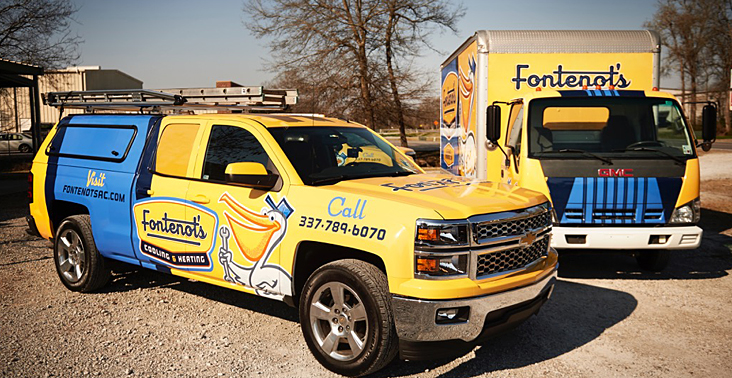 Chuck: How old are you guys? How and when did you begin designing logos? Dan: I’m 45. From the time I was 15 and working in a sign shop, I’ve been fascinated with logo design. After college and a stint in NYC as a designer, I started our agency with the focus being on branding for small businesses, and how that branding lived on their marketing materials. You could say I’m pretty obsessed with logo design, having done about 1000 logos in the last twenty years with about 75% of those being done with Jeff, who’s been with me full time since about 2006. I’ve also written and published 3 books on logo design, including one that I released last year titled ‘Building a Big Small Business Brand’. Today our agency has 20 people, and our focus on small business branding as the cornerstone for successful advertising remains.. Jeff: I’m 35. Having a lettering artist for a father, I was exposed to the industry at an early age, and would spend a lot of time drawing on butcher paper in the garage while my dad was lettering signs, and received a lot of instruction from him early on. I’ve always been attracted to logos specifically, and as I got older, I started making logos for imaginary companies which I would cut out of vinyl and apply to my skating helmet. I think I was about 16 when I started working on designs for real projects at my dad’s shop after school. Although the designs I produce end up as digital files, I think having a background in traditional tools and lettering has given me a much stronger foundation as a designer. . Chuck: What is the key to a successful logo? Dan: There’s so many factors that go into making a successful logo. One thing we truly believe is that 95% of every small business has a poor logo - one that delivers a neutral or negative brand promise. And success in spite of a poor brand is not a valid reason to perpetuate it. If you can imagine all the impressions a brand makes on a consumer - if 95% of them already start from a bad place - what would happen to your business if you lived in the 5% realm? So many judgements are made about a small business based on the consumers various interactions with their touch points. So what does that truck say about that business? Or their sign? Or web site? If the person viewing it has either no impression (neutral), or a negative impression, then they are already starting that potential conversation on the defensive. But what if you saw a sign or their truck, and immediately got a positive brand promise from those interactions? That’s what a good logo does - it serves up a positive brand promise, and a reasonable expectation of a good experience based on how the brand is perceived. We want to control that first impression and have the consumer believe the company is amazing - even if they have no prior knowledge or experience with them. It is then on the business to deliver on that brand promise. We have so many clients who deliver a great product or service - but the problem is - they just don’t like they do with their current branding. When we marry the excellent service a business provides with an excellent brand - their competitors really don’t know what hit them. One other point to mention is that small business logo design is a different animal than corporate logo design. With corporate work, no matter what is developed - if you throw enough money at any symbol or graphic, people will eventually associate it with that company. Small businesses don’t have the same luxury - so each impression is important. You need to very quickly connect with your audience and give them something to latch onto, that’s also disruptive in their competitive space. Again, with so many small businesses suffering from poor brands, therein lies the opportunity to be unique, and to stand out. Jeff: An effective logo should be appropriate, distinctive, and memorable. By appropriate, I mean the logo should be consistent with and reinforce the qualities of the brand it represents, and function well in a variety of usage scenarios. It needs to be distinctive in its market in order to be noticed and identified, and to not be confused with another brand. It should be memorable in that it should make a lasting impression in the mind of the consumer that may be recalled when the consumer is in need of a particular product or service. See more of Jeff & Dan's logo work at: Graphic D-Signs Purchase Dan's book: Building a Big Small Business Brand |
  |
 |
|
|
CONTACT
|
|
|
|
|
|
|