I have a habit of pausing and rewinding TV shows and movies when I spot signs or other lettering. For this reason, people know better than to watch any program or movie with me. I was watching the movie "Of Mice and Men" (the 1992 version with Gary Sinise and John Malkovich) last week and spotted this out of place looking sign:
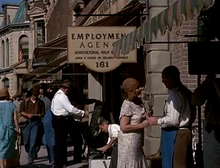
The word "Employment" on the employment agency sign looks suspiciously like Friz Quadrata Bold, which wasn't created until 1965. Three things give it away as being Friz Quadrata: First, the bottom horizontal stroke of the "E" sticks out further than the other two. Second, the way the "P" tapers at the end and does not connect with the straight stem. And third, the way the peak in the middle of the "M" tapers on the left side. Friz Quadrata is a very distinct and recognizable font (and better used in it's original regular weight, rather than bold like this). Being that "Of Mice and Men" takes place in the 1930's, Friz Quadrata would not have been a part of any sign painter's repertoire.
If you like that, check this out...
This is a screen capture of a scene from the movie "The Good Shepherd" where Matt Damon steals the briefcase from the Nazi professor. That isn't Helvetica used for the title. That's Arial! (The "G" is a dead give away) Notice the document is dated 1939. Arial wasn't created until 1982. The smaller text is Times Roman, which would have been available to use for mass production like newspapers. But if the professor had created this list for himself or even a few people, he would have used a typewriter. So just how exactly did the professor create this clean laser-copied document with a nice big red title set in Arial?
And if that wasn't enough, there is another obvious mistake with the document. The German translation of the word "The" should actually read "Der".
Now you know why people won't watch movies with me.
--Chuck


