Chuck Davis, Founder
For some time now I've felt compelled to showcase some of my favorite, but under appreciated, LHF fonts. So every two weeks through the summer months, I'll personally be showcasing fonts I have used in my own designs, but do not really receive the attention they deserve. And to entice you to check them out yourself, we'll be offering a temporary discount for these showcase fonts.
Our first Showcase font is
LHF Silent Movie from "
The World's Hardest Working Font Designer".
Silent Movie was originally released at the end of May, 2008. After being inspired by some examples by Samuel Welo and others, John Studden and I decided that there was a real need for a font like this.
The background of this style is interesting. This style was painted by hand on transparent film and was popular for silent movies. It was critical that each letter be painted in one continuous smooth stroke. Any touching up of strokes, would result in that area appearing bolder and more opaque than the other sections of the letter. So all the strokes had to be the same thickness. This resulted in a more uniform appearance on screen.
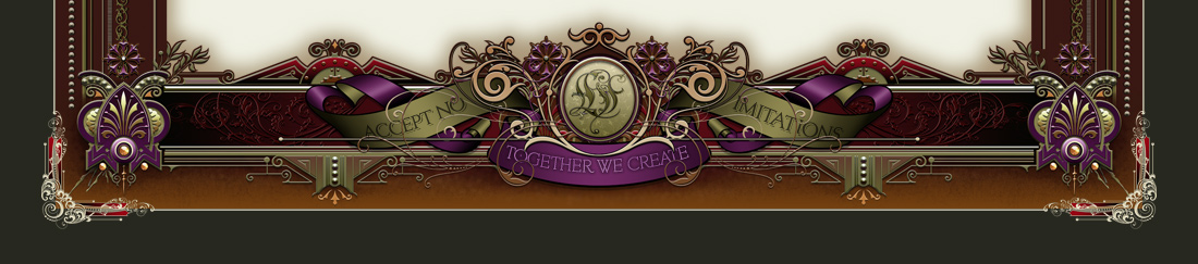
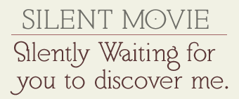
The little quirks of the letters are beautiful. I know people like decorative, flashy fonts, but Silent Movie is one of those fonts that is subtly decorative and not overdone. When letters like the lowercase "a" sit next to round letters like "o", this subtle beauty is appreciated. It is decorative enough to give interest to the word, but not so much as to take away from the other letters and hinder readability. The beauty is in the balance of the strokes. But Silent Movie is a versatile font set and can take on a more modern appearance as well. Especially when the letters are used in all caps and spaced widely like so:
My favorite letter is probably the "R" from LHF Silent Movie 1 as shown above. I really like the way it almost touches the main stroke, but doesn't. The leg kicks out far enough to give it a kind of laid-back cool attitude... and it curls a bit at the end. For me, the above word is near typographic perfection. The "O" with the dot in the middle, together with the curl of the end of the "R" give the word a unique style. The "G" is very subtle and crossbar only hints that it is really a "G". It isn't necessary to make the crossbar any wider because the right side of the "G" helps to define it as well.
Another example of Silent Movie used for a more modern design is this one:
As you can see, Silent Movie 1 is perfect for sub copy text. It's easily read and doesn't steal the limelight from the main copy.
But the Silent Movie set actually contains 2 different fonts. LHF Silent Movie 2 contains more decorative caps with swashes. These should be used sparingly of course. But when mixed with LHF Silent Movie 1 caps, the result is quite creative:
For those that don't like the late 1800's upside-down "S", we also offer a more traditional "S" as an alternate. And of course LHF Silent Movie 2 contains another curled "S" as well. There are also some useful alternates included. When we were testing the font, we discovered that the lowercase "i" didn't look nice when it came after the regular "S". So we created a special ligature for that, as shown in the word "Silently".
LHF Silent Movie is a pretty versatile set and it is genuinely beautiful. Yet I think many people overlook it because it just isn't flashy. But try it for your next sub copy text or when you have multiple lines of upper and lowercase -- I think you'll appreciate it's subtle charm.
The regular price for LHF Silent Movie is $42, but if you decide to try it out, we'll give you a special discount of $10 off, so you'd only pay $32. But this offer will only be valid until June 9th, when I'll be showcasing a different font.
Check out all the
Silent Movie letters and samples here.
--Chuck