Chuck Davis, Founder
Every 2 weeks I'll be featuring a new font that I feel is under appreciated and deserves your attention.
Next up is
LHF Squeezebox by
Dave Parr.
I really like Squeezebox and designing with it is just plain fun. The
letters have a squarish boxy feel to them, yet the serifs and strokes
bow in slightly. This combination gives it a serious, but friendly
appearance. The large height of the lowercase makes them easy to read
and gives it a straight line so 2 lines of lowercase letters can be stacked easily. Usually, you couldn't do this when using lowercase letters due to the awkward and distracting gaps that are created as a result. But with the squarish tall lowercase in Squeezebox, you can pull it off...
My favorite letters in Squeezebox are the uppercase Q, R, K and E. The
way the leg of the R and K kick out slightly gives them nice style and
balance. The crossbar of the "E" is decorative, but not overdone, in
order to prevent it from bringing too much attention to itself.
When used in all caps, LHF Squeezebox tends to appear more masculine and forceful...
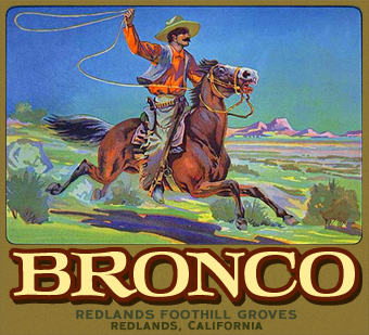
But mixed with lowercase, the font takes on a softer, more friendly appearance...
You can also try juggling the letters up and down for a more freeform look...
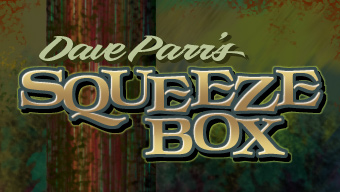
As you can see, LHF Squeezebox is a very versatile font and Dave did an
excellent job of balancing the stroke widths to ensure that each letter
works together. Take a look at
Squeezebox here
and decide for yourself. We are offering a $8 discount for LHF
Squeezebox for 2 weeks only. So instead of paying $42, you can download
it for only $34 until June 23rd.
--Chuck


