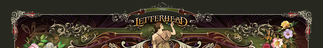


-
36 Sales
62 Ands
62 Thes
62 More Ands
62 More Thes
Advertisers Square
Alarm Block
Albury
Aledo
Aloha Script
Alpine Script
Amarillo 2
Ambrosia
American Sans
Americana Ornaments
Americana Panels
Americana Ribbons
Americano Script
Amethyst
Angel
Anna Banana 2
Antique Half Block 2
Antique Shop
Aristocrat
Ascribe
Asylum
Ataboy 165
Athletic Club
Avalanche
Bakersfield
Ballpark Script
Bandit
Bandolier
Bank Note
Basher
Beatnik Cowboy
Becker Classic
Becker No 45
Bella Vista
Bell Boy
Bergling Panels
Betterbilt
Big Bob
Big Dog
Big Top
Billhead
Birgitta
Black Rose Script
Blacksmith
Blackstone
Bluegrass
Blue RidgeNEW!
Boot Camp
Bootcut
Booth
Borges Catchwords 1
Borges Catchwords 2
Boston Ballpark
BostonianNEW!
Boston Truckstyle
Bounce Script
Branding Iron
Brianna
Broadway Elements
Broadway Panels 1
Broadway Panels 2
Broadway Panels 3
Broadway Panels 4
Brooklyn
Brough Superior
Brushwork
Bulldog
Burbank
Burly
Cafe Corina
Californian
Calileo
Cameo
Carbondale
Carnivàle
Cartoon Cowboy
Casablanca
Castlerock
Cavalero
Cedar Creek
Centennial Banker
Centennial Panels 1
Centennial Panels 2
Centennial Panels 3
Centennial Panels 4
Champ
Chapman
Chateau
Chesham Sans
Chicago Script
Chromeliner
Chunky Block
Cigar BandNEW!
Cincinnati Poster
City Boy
Claretian
Classic Caps 2
Classic Panels 1
Classic Panels 2
Classic Roman 2
Coffee Shop
Colonial Roman
ColumbianaNEW!
Comic Caps 2
Commie Caps
Conclave
Confection
Confection Essentials
Conservatory
Convecta
Cool Blue 2
Cordial
Cornbread Casual
Corner Specimens 1
Corner Specimens 2
Corner Specimens 3
Corrie
Cosmic Cursive
Counselor
Country Road
Dark Horse
David Design
Desire
Desire Rough & Ragged
Dickinson
Diploma
Distressed Block
Divine
Dixon Script
Doc Terwilligers
Dreadnought
Dublin
Duetta
Durango
Egyptian
Elixir 2
Emporium
Enchanted
Encore
English Rose
Engravers Ornaments
Ephemera
Equinox
Esoteric 3
Essendine 2
Euphoria 2
Factory
Fairground
Fancy Full Round
Farango
Fast Slant
Fat Cat
Fat Daddy
Fine Cut
Fine Line Roman
Firehouse
Five & Dime
Flamingo Script
Flash Script
Flathead
Folklore
Full Block
Future Tense
Garner
General Store
Gilmore
Ginger AleNEW!
Gloria
Golden Era Art Elements
Goldsmith Script
Grants Antique
Grindle
Gunslinger
Gypsy
Hambone
Hamilton Nailhead
Hamilton Ornate
Handyman
Happy Fun Ball
Hastings Gold
Havana
Hazel
Heller's Script
Henderson
Hensler 2
Heritage
Hertford
Hexagon Modern
Hick Sticks
Hindlewood
Hudson
Imperial
Indian Script 2
Inkling
Ironhorse
Iron Knight
Iron Lace
Jalopy Joe
Jeff Marshall Script
Jewelo
Jumbo
King Edward
Kips Bay
Kiwi Casual
Kodiak
Kona Bold
Kung Faux
Lakeside
Larcher Roman
Light Face Roman
Lincoln
Locksmith
Logomotive
Lonerider
Lumbermill
Mackinlay
Magnum44
Main Street Ornaments
Main Street Panels
Majestic
Marie Script
Mastercraft
Matthews Modern
Matthews Thin
Melissa
Menace
Mercantile
Metro 39
Mikes Block
Milkman
Mister Kooky 2
Mister Muster
Mocha Script
Monogram Circle
Monogram Diamond
Monogram Oval
Mystery Font
Naylorville
New English
New Modern Classic
No Fishin
Novela
Nugget
Old Abe
Old Block
Old Flame
Old Iron
Old Stock
Old Tom
Olde Hickory
Opening Night
Orange Grove
Orchard
Ortlieb
Packard Script
Palace Bold
Pandora
Phantom
Pickle Barrel
Pierre
Pipeline
Piranha Script
Prentice
Preston
Prince
Pullman Train
Quadrex
Quaker
Quantum
Razer
Ragged Brad
Ransom
Raven
Rawson & Evans
Red Sable Script
Resolute
Retro Cafe
Retro Ricky
Ridgecrest
Ringer
Riverboat
Robusto
Roebuck
Roper
Ross 1929 Roman
Ross Antique Roman
Royal Crimson
Royal Script
Saddleback
Sadey Ann
Safire
Sanborn Thin
Sarah Script
Saratoga Ornaments
Saratoga Panels 1
Saratoga Panels 2
Saratoga Panels 3
Saratoga Panels 4
Sawbones
Scarlet Script
Scriptana
Sedona
Seranoa
Shelsey
Sheridan Script
Shocard Rodeo
Shogun
Shopfront
Signature
Signkit Script
Signmaker 2
Signwriter Roman
Silent Movie
Sinclair
Smalts
Sofia Script
Spaz
Speakeasy
Speedstyle
Spencer
Spindly
Spirit Script
Splash
Springfield
Spurred Egyptian
Square Block
Squeezebox
Stanford Script
State Fair
State Street
Stetson
Stevens Percepta
Stonecutter
Story Book
Stove Pipe Thin
Stratford
Stunt Roman
Sugargirl
Supply Co.
Swindler

-

-

-


-


 |
ACCOUNT LOGIN |  |
YOUR CART |  |
|
Chrome Effects (continued) 6. Adding the top color Using the Rectangular Marquee Tool again, draw a box around the top portion of the letters starting at approximately the center of the letters where the gold color stops. Then go to Select | Feather and use 10 pixels. Go to Image | Adjust | Hue/Saturation. Check the Colorize box and use the following settings: Hue: 196, Saturation: 37, Lightness: +44. I then airbrushed certain portions of the T with white to soften the appearance a bit. Notice the blue area below the cross member has been lightened, as well as the ball at the beginning of the cross member at the far left. 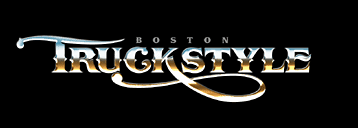
7. Creating the background The hard part is over-now for the fun stuff. Holding the Ctrl key down, select the layer you duplicated in step 1 containing the original white letters. This will create a mask around your letters. Go to Select | Modify | Expand and use 10 pixels. Using the eyedropper tool, select the brick red color from the Swatch palette. Go to Edit | Fill and choose Foreground Color. Deselect the mask by going to Select | Deselect and then position this red outline behind the chrome letters. Now duplicate this layer for later use. Blur the red outline layer by going to Filter | Blur | Gaussian Blur and using 36.0 pixels. 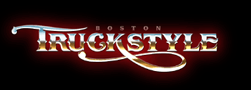
8. Creating the black outline
Select the red outline layer you duplicated in step 7. Change it to black by going to Image | Adjust | Brightness/Contrast and sliding both values to -100. Tip: You can also change the color of an object by going to Image | Adjust | Hue/Saturation and experimenting with the sliders until you see a color you like. This method is preferable to creating a mask and actually filling the object different colors, since doing so will result in noticeably jagged edges. 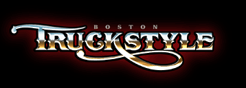
9. Creating the black dropshadow Duplicate the black outline you just created and position it to the right and down-behind the black outline and in front of the red background. 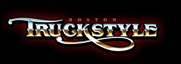
Finally, we add the sparkle of light at the lightest point on the lettering. Make a new layer. In your brushes palette, select the brush that looks like a four-pointed star. If you don't see it, you will have to load it. It's within the Assorted Brushes set, which is located in the Photoshop folder on your hard drive. Using the regular paintbrush at 100%, click near the place you would like to place it. Don't worry if it's not exact-we put it on it's own layer so that we can move it around later if necessary. You may have to click a few times in the same spot. Now enlarge that by going to Edit | Free Transform and holding shift while dragging one of the corners. Enlarging it will blur it, which is what we want. Rotate it if necessary so that you can see the other points. When you are satisfied, double-click in the center-or hit the Enter key if it's too small. Place these starbursts where the light would naturally hit the raised chrome letters. Our shadow is on the right so our hotspot is naturally on the left at the point where the light would be the brightest. Be careful about putting too many of these things all over-doing so can ruin the effect. Finally, save this file so you have a file with all these layers. Name it something like truckstyleLAYERS.psd. Flatten it, and then sharpen it by going to Filter | Sharpen | Unsharp Mask, using about 34%. Save it with a different name such as truckstyleFLAT.psd. 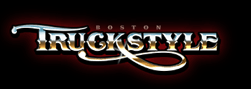
|
  |
||
 |
|
|
CONTACT |
|